11.08.2012

"Birthday for Robert, October 28" by Joe Betz


Click the image to read the full text of the poem, or purchase it here
the Poet:
Joe Betz is a graduate of the University of Missouri – St. Louis MFA program in Creative Writing. In 2009, he won the Goldstein Prize from Michigan Quarterly Review. In 2010, he won the James Russell Grant Poetry Prize from the University of Missouri – St. Louis. In 2012, he is still writing, this year in Indiana, where he teaches as an adjunct English Instructor. Always, he is thankful you read poetry.
the Poem:
This poem is so tight and so tender all at once: tight in a structural sense with lines of three syllables arranged in tercets, but also in its economy of language and detail; tender in its willingness to look away from the shortcomings of its subject (“the blindfold… fits.”). The lines wave back and forth across the page like a child swinging at a piƱata, while the poem itself sways between memories of success – “all those sweets” – and failure “air is/ the only// thing cut.” It takes great finesse (and love) to acknowledge the later without blame; the result is a beautiful, bittersweet remembrance.
the Design:
Title & Name: 24 & 20pt Garamond roman bold
Dedication: 12pt Garamond italic
Body: 12pt Garamond roman
Garamond is one of the most readable typefaces, a style that is at once present and transparent, the letters being clear but not calling attention to themselves. They let the subtle emotion of this poem shine. It’s especially appropriate for another reason: all the current iterations of what we call Garamond are an homage to their progenitors, the Sixteenth Century French printer Claude Garamond, or to Jean Jannon, another, slightly later French printer whose work was mistaken for Garamond’s for many years.
Editorial & Design by Architrave Press, St. Louis 
Letterpress printed by Paper Boat Studios, St. Louis

11.05.2012

"Doll" by Erica Minton


Click the image to read the full text of the poem, or purchase it here.
the Poet:
Erica Minton lives, works and loves in Cincinnati, Ohio. She can be reached at ericaminton -at - gmail.com.
the Poem:
In poetry, what’s left out matters just as much as what’s included, and this poem is a great example. Minton’s speaker doesn’t bother to give her reasons for leaving or how she spent the year away; it’s possible she doesn’t have any, but even if she did, they’re irrelevant. What really matters is how easily the speaker abandons her relationship. There’s no plan, just a random thrift store find and then she casts off, leaving someone else’s cast off doll in her place. It happens just as easily in life. One day you wake up and realize you’ve been going through the motions. Hopefully you’ve come back in time, before your partner’s hair has turned to yarn.
the Design:
Title & Name: 48 & 24pt Santa Fe
Body: 12pt Lights Out, designed by Brian Kent
A poem about subterfuge needs a typeface that’s a little fuzzy, inexact, without looking handwritten. In other words: a facsimile. Fortunately the resurgence of letterpress has spawned a parallel interest in new typefaces that replicate the quirks and imperfections of antiquated type. Lights Out is one such new face that strikes the right balance for this poem. It’s very regular, but the edges of the letterforms have been nicked away, leaving the body of the poem looking a little disheveled. And like an old rag doll, the stanzas are arranged on the page in a bit of a slouch. Sante Fe is a complete departure from Lights Out, just like the real woman speaking this poem is no doll.
Editorial & Design by Architrave Press, St. Louis 
Letterpress printed by Paper Boat Studios, St. Louis

11.01.2012

"On My Persistent Need..." By Meg Matich


Click the image to read the full text of the poem, or purchase it here.
the Poet:
Meg Matich has been previously published in The Drunken Boat’s Bernadette Mayer Folio, and has work forthcoming in OVS Magazine. She is currently studying for her MFA in Writing –Poetry and Literary Translation at Columbia University in New York City, where she also interns at Litmus Press. She received her BA in English/ German from Saint Vincent College and is the founding editor of Typografika, a Munich-based literary magazine.
the Poem:
The connection between name and identity is not a new mystery. A rose by any other name may smell as sweet, but could Marion Morrison have been just as tough as John Wayne? What’s at stake in this poem, though, isn’t an exchange of one identity for another; what’s different is the speaker’s fear of losing her identity entirely, that she slips further into anonymity with each shortening of her name. We tend to think of these short names as terms of endearment, but they can also function pejoratively, to diminish the person referenced. Neither is it universally true that using a person’s full name signifies anger, as Velentin assumes. So what’s our speaker to do but lead by example with “an incantation” to enjoy “the found phonetic beauty” of Valentin’s full name?
the Design:
Title & Name: 24 & 18pt Century Schoolbook
Body: 12pt Didot roman & italic
Perhaps it’s that the man in this poem has a Russian sounding name, or maybe it was the air of formality created by using full first names. Maybe it was the sonnet form… or maybe it was all of these things together that suggested a formal, classic book typeface. But there’s also an intimacy about the piece that required the face to have a bit of a romantic flourish. This is a job for Didot. The descender on the lower case y, even in the roman, has a slope and curl that could be a woman’s arm and hand, artfully tracing the back of a couch as she walks past. The curves of its bowls manage to be voluptuous, even when the letterforms stand perfectly straight. Century Schoolbook has a similar weight and so compliments Didot while the vertical arrangement of the title reflects how at odds the speaker is with her own, seemingly arbitrary need.
Editorial & Design by Architrave Press, St. Louis 
Letterpress printed by Paper Boat Studios, St. Louis

10.29.2012

"Dumping My Trash in the Neighbor's Bin" by Michael Jones


Click the image to read the full text of the poem, or purchase it here.
the Poet:
Michael Jones teaches at Oakland High School in Oakland, CA. His work appears in Atlanta Review, Beloit Poetry Journal, and other places. He tries to be a good neighbor.
the Poem:
Yes, poems really can be about anything, even taking out the trash. Really, though, this one’s about that question: what’s to see? It’s a corollary to whose business is it, anyway? How many times have you felt a little funny, say, letting yourself into your neighbor’s home because they’ve asked you to water their plants or feed their cat? Maybe you decide to try a new coffee shop and catch yourself feeling like you’ve cheated on your regular spot. Whatever forms they take, ideas about where we do and don’t belong are durable and sometimes outlive their usefulness. So asking what’s to see can be a liberation. In a short poem such as this, it functions like a haiku, where, in the silence after the poem, that expansive feeling of “filling whatever space will have [you]” is what matters most.
the Design:
Title & Name: 18pt American Typewriter Bold
Body: 14pt American Typewriter
14pt Schoolhouse Cursive B
Typewriters and practice with cursive handwriting are two things that have been discarded in the digital age; their representative typefaces serve here as evidence of what might be going into the trash. The arrangement of the title and poet’s name mimics the lid of a certain style of trash receptacle currently ubiquitous in cities and suburbs alike.
Editorial & Design by Architrave Press, St. Louis 
Letterpress printed by Paper Boat Studios, St. Louis

10.25.2012

"The Crackers Need To Know... " by Amy Wright


Click the image to read the full text of the poem, or purchase it here.
the Poet: 
Amy Wright is a 2012 fellow of the Kenyon Review Writers Workshop, the Nonfiction Editor of Zone 3 Press and Zone 3 journal, as well as the author of three chapbooks—Farm, There Are No New Ways To Kill A Man, and The Garden Will Give You A Fat Lip,which won the 2012 Pavement Saw Chapbook Contest.
the Poem: 
“Just to be clear” a poem’s speaker can have a very different agenda than the poem itself. Amy Wright uses that to good effect against one of the uglier bits of human nature: our need to judge each other’s differences. Her speaker starts off well enough, able to see through phrases like “not to be racist” and to understand how stereotypes erase nuance. (The term “cracker” originally referred to slave drivers who were mostly white but not exclusively so.) But the repeated use of the word “cracker” quickly slips it back into stereotype, which is where the poem’s agenda diverges from the speaker’s. What’s heartbreaking is that the speaker doesn’t seem to realize what’s happening, that with every “they keep track” or “they need someone” she distances the group she’s describing until they’re merely “coexistent,” lacking any common ground. So while the speaker pigeonholes a group into a stereotype, the poem seeks to expose how insidious those racial stereotypes are. It’s a disturbing poem because we have so far yet to go.
the Design: 
Title & Name: 18pt Century Gothic, Roman & Italic 
Body: 12pt Copperplate 
Copperplate’s small caps read like a shout and reinforce the poem’s indignant tone. It’s letters are blocky, too, each of them a tiny version of the large block of text that is this poem’s body. It’s a visual brick, heavy, like the subject matter. The length of the title required a typeface that had open bowls similar to Copperplate, but lighter; Century Gothic strikes that balance.
Editorial & Design by Architrave Press, St. Louis 
Letterpress printed by Paper Boat Studios, St. Louis

10.22.2012

"Ostensible" by F.J. Bergmann


Click the image to read the full text of the poem, or purchase it here.
the Poet: 
F.J. Bergmann frequents Wisconsin and fibitz.com. She has no academic literary qualifications, but hangs out a lot with people who do. Publications where her work has appeared include Asimov’s Science Fiction, Eschatology, Mythic Delirium, Strange Horizons, Weird Tales, and regular literary journals that should have known better. She is the editor of Star*Line, the journal of the Science Fiction Poetry Association sfpoetry.com, and the poetry editor of Mobius: The Journal of Social Change, online at mobiusmagazine.com. Chapbooks includeConstellation of the Dragonfly (Plan B Press, 2008),Aqua Regia (Parallel Press, 2007), and Sauce Robert(Pavement Saw, Press 2003). Out of the Black Forestis forthcoming from Centennial Press in 2012. One of her pseudopodia can reach all the way from the bedroom to the refrigerator. Her hairstyle is deceptive.
the Poem: 
Meaning is more than what’s found in the dictionary. Words carry emotional weight, too, which is more difficult to describe. Saying “the word Ostensible has a negative connotation” or “implies dishonesty” is true, but incomplete; it doesn’t describe how it feels to suspect a ruse. At least not in the same, visceral way as “a hungry dog who/ says I won’t bite/ one two/ many times.” It doesn’t get at the motivation for duplicity quite like “the drooling memory of meat” or the character of a deceiver who “dare[s];/ to pluck the leaf of strife.” So it’s fitting that Bergmann patterns her poem on a dictionary listing, but avoids the actual word roots in favor of associations. She’s investigating the possibilities.
the Design: 
Title & Name: 18 & 38pt Cheltenham ITC Bold 
Body: 12pt Imperial BT Roman & Italic 
This poem is an investigation of meaning. Journalists do similar work then describe what they find in print. The typefaces used by the paper of record therefore made a perfect match for this poem. The New York Times uses Cheltenham for headlines and Imperial for the body of each article. The poem’s title is stretched out, so that the letters begin to lose touch with each other, losing a bit of legibility and therefore meaning; it’s a word breaking into its parts.
Editorial & Design by Architrave Press, St. Louis 
Letterpress printed by Paper Boat Studios, St. Louis

10.18.2012

"Confessional" by Devin Becker


Click the image to read the full text of the poem, or purchase it here.
the Poet:
Devin Becker is the Digital Initiatives Librarian at the University of Idaho. His poems have been published in Cutbank, The Pinch, Faultline, and other fine journals. His article on the digital archiving practices of writers, co-written with Collier Nogues, is forthcoming from American Archivist.
the Poem:
Late nights are for wrestling with fear, be it consciously or otherwise. Devin Becker’s poem has all the likely suspects: preachers of fire and brimstone, the TV, a god that does and does not exist, water that gives and takes life. The speaker knows he “is not all right,” he “do[es] ill/ and no one notices,” but he also understands how much he doesn’t know. (How well could anyone really understand a dream state full of “metaphors of metaphors”?) Perhaps that’s the point: there is no knowing. And does it even matter, when the god we feel we’ve made up saves us yet again? It matters to the speaker, who by the poem’s end, is in God’s boat.
the Design:
Title & Name: 24 & 30pt Goudy Old Style bold
Body: 12pt Optima roman & italic
The indented lines plus the very long middle line create a visual back and forth effect more pronounced than when text is entirely flush left. Centering and kerning open the title and poet’s name reinforce this effect. It’s all with an eye toward the physical space of the confessional, with its curtains that slide open and closed around each act. Optima occupies the tiny gray area between seraphed and unseraphed typefaces, an appropriate choice for a poem about a space that both is and is not a true confessional.
Editorial & Design by Architrave Press, St. Louis 
Letterpress printed by Paper Boat Studios, St. Louis

10.15.2012

"Moult" by Lisa J. Cihlar


Click the image to read the full text of the poem, or purchase it here
the Poet:
Lisa J. Cihlar’s poems have appeared or are forthcoming in The South Dakota Review, Green Mountains Review, The Prose-Poem Project, In Posse Review, and Blackbird. She is the author of two chapbooks, The Insomniac’s House (Dancing Girl Press, 2011) and This is How She Fails (Crisis Chronicles Press, 2012). She lives in rural southern Wisconsin.
the Poem:
Poets love lists so much that it can be hard to make a truly fresh one, but Lisa Cihlar has managed it. First, she pulls us in with a vivid inventory of organic detritus. Her speaker is fascinated with the kind of remains that quickly disintegrate or blow away; she lingers on beauty and grossness, the remarkable and the mundane in equal measure. And then there is the glue gun. Just as the speaker uses it to create a new self, the poet uses it to transform the poem. What was previously cast aside gets incorporated into a new whole: “my fresh self. A cachet I never had before.” But selfhood is never that simple, never only cobbled together bits – it also emerges, sui generis, in this case from “the hollow/ in the lightning struck oak,” shedding splinters for someone else to find. It’s a beautiful way to describe what it means to be human.
the Design:
Title: 30 & 60pt Optimus Princeps semibold
Name: 24pt Optimus Princeps
Body: 12pt Baskerville italic
This poem meditates on transformation, more specifically on the remnants left behind and the hint they give about the shape of what continues. To amplify that movement inherent to the process, an italic was necessary, preferably in a classic typeface to reflect the durability of this type of struggle. Baskerville is just such a venerable face. The letters themselves squiggle and squirm; its italics allow plenty of white space around the letters, the suggestion of the space inside a husk. The typeface for the title and name needed to be similar but strongly anchored to balance the motion of so much italic. Optimus Princeps is similar to Baskerville in both its seraphs and its contrast between thick and thin strokes, but it remains distinct and achieves the desired effect.
Editorial & Design by Architrave Press, St. Louis 
Letterpress printed by Paper Boat Studios, St. Louis

10.11.2012

"Postcard Number 64" by Mary Stone Dockery


Click the image to read the full text of the poem, or purchase it here.
the Poet: 
Mary Stone Dockery is the author of Mythology of Touch, a poetry collection. She is also the author of two chapbooks, Blink Finch and Aching Buttons,both forthcoming, as well as a collaborative chapbook, Honey and Bandages, co-written with Katie Longofono. Her poetry and prose has appeared or is forthcoming in many fine journals, includingSouth Dakota Review, Mid American Review, Arts & Letters, Gargoyle, and others. She currently lives, writes, and teaches in St. Joseph, MO.
the Poem: 
This poem is packed light for travel. That’s not to say it’s lightweight, more that it has jettisoned anything that might impede its leaps. And those leaps come as progressively more startling images. It starts in familiar enough territory, with the small surprises of a new landscape. But then it takes a breath (“Didn’t I tell you I’d write?”) and jumps, from the place itself to how the speaker is assimilating into it, how her “feet spend/ over new sidewalks,/ purposeful.” From there the speaker leaps from one peak of wonder to the next and it’s hard to know if the images signify inward or outward experience. Maybe it’s both. Maybe it’s not important to know. Maybe what’s important is how a solid, external thing like a pebble, because of its color and shape, can take on the qualities of a private, inner thing like a lung, and how that transfer works in the other direction as well. What’s outside softens and comes in; what’s inside hardens as it’s exposed. Are we in the speaker’s head, or are we in a physical landscape? Is there a difference?
the Design: 
Title & Name: 18 & 24pt Prime Minister of Canada By Ray Larabie at Typodermic 
Body: Aji Hand, By Ajth R 
This is a postcard, a hastily scribbled note from a faraway friend. The slant of Aji Hand accentuates that haste, as do the tilt of the poem’s body and the block capitals of the title, squeezed into the remaining space, almost as an afterthought. All of it underscores the fresh energy of the speaker’s discoveries.
Editorial & Design by Architrave Press, St. Louis 
Letterpress printed by Paper Boat Studios, St. Louis

10.08.2012

"On the Fifth Level" by Niki Nymark


Click the image to read the full text of the poem, or purchase it here.
the Poet: 
Niki Nymark’s work appears in local, national and international journals, magazines and anthologies. Her chapbooks include Kavannot, Nothing Smaller Than Your Elbow and A Stranger Here Myself. She is a member of the Loosely Identified Poets Society, a women’s writing collective.
the Poem: 
Microfiction or prose poem? It’s kind of like trying to differentiate between identical twins: even their mothers can be fooled. What’s known: from Fiction, the children inherited a crisp narrative arc; from Poetry, they inherited compression. In this piece there’s plenty of dialogue and a clear scene, all familiar territory. But it’s the compression that makes it really work. We get just a peek at what turns out to be an essential moment in someone’s life, a glimpse so short that the scene doesn’t so much conclude as build to a punch line. Without a denouement, there’s room at the end for silence, for the reader’s emotions to surface without further interference from the poet. At first you chuckle at how blind the man is to the magnitude of talking to God, and then it hits you: how many times have you said that last line? How many times have you wished someone listened to you better?
the Design: 
Title & Name: 18pt Helvetica Bold 
Body: 11pt Helvetica 
The man described in this poem is hungry for a sign that God is not completely indifferent to him, but he fails to recognize his phone connection as that sign. It’s a perfect match for Helvetica, now so ubiquitously used in public signage that it’s easy to miss. You have to learn to recognize it, but once you do, it’s everywhere.
Editorial & Design by Architrave Press, St. Louis 
Letterpress printed by Paper Boat Studios, St. Louis

9.05.2012

Reasons to Come to St. Louis

the Tavern of Fine Arts
     The very best reason, is to meet Edition 3!

     Saturday, October 6
     at the Tavern of Fine Arts
     313 Belt Ave, St Louis 63112

     Reading at 7pm sharp:
     Joe Betz (Bloomington, IN)
     Niki Nymark (St. Louis, MO)
     Mary Stone Dockery (St. Joseph, MO)


And as if that isn't enough reason, maybe Anastasis Films can convince you:

Here is St. Louis from Anastasis Films on Vimeo.

8.13.2012

Fun with Type

If you read GallyCat, you may have already seen their blurb about an interesting new blurb about the book Just My Type. In it, there's a Periodic Table of Type. (Yes, type nerds, you heard me right. I'm squealing with delight right along side you.) Reminds me a little bit of Jeffrey Skinner's Periodic Table of Poetic Elements.

8.06.2012

Keeping Bright Company - Guest Review by Karen Lee Lewis


NB: Reading poetry is as much about how it makes you feel as it is about the meaning of the words. Sometimes, the emotion is even more important than the definitions. This review embraces that stance; it's something I hope more readers can learn to embrace. - JT

BOA Editions (2010)
Keetje Kuipers' book of poetry, Beautiful inthe Mouth, is sculpted with various bodies in mind. She has pressed them for us like flowers into her book. She grounds the work in a tangible physicality, giving the reader many different hands to hold throughout. Kuipers begins and ends with the body, and is particularly interested in its placement in the world. Her eyes paint the concrete with just enough abstraction to create layered landscapes that transform and surprise. The collection, set out in five sections, is a trail guide to light and shadow, and she pinpoints it where ever possible inside the poems, inside lit cigarettes and lamplights, inside fading paper roses and the hulls of boats. We follow the speaker as she attempts to locate a place where the light never sleeps inside her, a place where she can keep bright company, where she feels at once both alone and held together by a body that is not her own.

8.02.2012

Geek Out!

The good people over at Open Culture have put up a post with links to Borges' Norton Lectures on Poetry. They were delivered in 1967-68, but they are timeless. Lose yourself...

6.25.2012

Community for Poetry Lovers in the Internet Age

I recently stumbled upon a great project called "a poem from us" which encourages people to make a video of themselves reading their favorite poem, then submit it for posting to the web. Each person also posts a short explanation of why they chose their poem.


Some of the readers are themselves well known poets, like Aimee Nezhukumatathil (reading Naomi Shihab Nye), but most are regular folks, like Liam Strain reading a short piece by Goethe. I think my favorite, though, is from a young woman who signs herself simply Haley, reading Emily Dickinson's "I'm Nobody! Who Are You?" Haley, wherever and whomever you are, you're a delight!

6.18.2012

A Brief History of Chapbooks

Noel Black over at KRCC Radio Colorado College offers a shortened recording of Matvei Yankelevich's talk on the history of chapbooks for the "Efficiency, Excess, and Ephemerality" exhibition. It's dubbed over images of chapbooks of various vintages, from presses far and wide. 


It's totally worth your time if, like me, you're fascinated by the book as object and/or the commerce of poetry. (Yes, there IS a commerce of poetry - often as a gift economy, but that IS an economy.) Turns out the chapbook has been threading the edges of society for hundreds of years. I'm pleased to follow along. 

6.11.2012

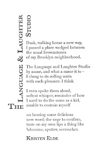
The Language & Laughter Studio by Kristen Elde


Click the image to read the full text of the poem, or purchase it here.

The Poet:
Kristen Elde wrote for large-circulation health/fitness magazines for years before turning to short fiction and poetry. These days she focuses almost exclusively on poetry, with poems appearing online atThe Nervous Breakdown. Her nonfiction work has run in magazines such as BUST, Health, Runner’s World,and The Writer. Kristen currently calls Brooklyn home, though her heart also splits time in Iceland and the Pacific Northwest. 
The Poem:
Did you “as a kid/ unable to contain [yourself],” revel in new words? Elde is inviting her reader to revisit that joy, to remember the words we loved for their sound before we knew their meaning. Consider how the repeated L and soft A sounds of “Language and Laughter” flow smoothly together, how the Bs and Ns repeat in “brownstones/ of my Brooklyn neighborhood.” To say it properly your tongue touches the roof of your mouth repeatedly, so it feels physically very different than the repeated vowels of “unable to contain” or “urge to confirm.” All of this is just a warmup, though, for the pleasure of saying and hearing yourself say a word like “seersucker.” Who cares that it’s a kind of fabric – those repeated Ss and Rs are like taffy on the tongue.
The Design: 
Title & Name:
 24 & 18pt Baskerville semibold small caps
Body: 13pt Didot Roman & reversed Italic
Didot is a contemporary of several other neoclassical typefaces all of which evoke the age of enlightenment. What could be better for a poem about the discovery of language? The reverse italic is an effect only possible with digitally generated type - it calls attention to those three words, emphasized like a traditional italic, but slightly odd because they are unfamiliar in the speaker’s mouth.
The title of a poem is (among other things) its advertisement, it’s invitation to enter, similar to the sign on the storefront described in the poem. In this case, the length of the title provided an opportunity to shape it into a kind of marquee. Baskerville is a cousin of Didot, a fellow book typeface. Small caps helped fill out the mass of the “sign” arrangement.
Editorial & Design by Architrave Press, St. Louis 
Letterpress printed on the Heidelberg at All Along Press, St. Louis

6.07.2012

Rising Action by Ray Holmes


Click the image to read the full text of the poem, or purchase it here.
The Poet:
Ray Holmes is a graduate of the MFA program at the University of Missouri—St. Louis. His poems have appeared in Fjords, Chariton Review, and Iron Horse. 
The Poem:
This poem is a treasure hunt. On the first read, all that’s apparent is disquiet. Something happened that summer, something important, but what? An initial survey of the territory reveals the outline of a regular summer full of girls, his father, chores, but after that, the reader must retrace their steps. It’s only on subsequent reads that the patterns begin to emerge, patterns of noise and silence, of nighttime darkness brought into the day by the eagles’ “noise and eerie bursts of shadow.” It gives an ominous cast to how the speaker is “growing” and “had more hunger.” But because this is a poem and not a story, there is no obligation for the poet to resolve anything. It is enough to make suggestions, to awaken memories of similar summers, when we knew the world had changed but we couldn’t immediately tell how. It is the essence of adolescence.
The Design: 
Title & Name:
 30 & 20pt Optima Roman
Body: 12pt Baskerville
This poem borders on story and a classic book typeface like Baskerville serves to reinforce that association. The title is a direct reference to story structure and therefore needed a typeface that feels sturdy, something capable of supporting the weight of everything that follows. Optima has the necessary solid verticals but also wide open bowls that leave plenty of room for the imagination.
Editorial & Design by Architrave Press, St. Louis 
Letterpress printed on the Heidelberg at All Along Press, St. Louis

6.04.2012

Anthology by Shane Seely


Click the image to read the full text of the poem, or purchase it here.

The Poet:
Shane Seely’s first book of poems, The Snowbound House, won the 2008 Philip Levine Prize for Poetry and was published by Anhinga Press in 2009. His work has recently appeared or is forthcoming in The Southern Review, The Florida Review, Cave Wall, and elsewhere. He lives and writes in St. Louis. 
The Poem:
This poem’s simplicity is deceptive. It invites multiple interpretations, but a complex discussion must begin somewhere. One starting point is with our basic desire to learn, how it propels us out into the world, to see and touch everything, the better to know. Quickly that’s followed by the desire to catalog what we find, to give it structure, and in so doing, make meaning. But then the desire to collect, to possess, rears its head. There’s a line, the poet insists, and there are consequences when you cross it. There will always be those who refuse to come quietly, to fit neatly into our structure, who “refuse/ to press the way the others/ pressed” and are diminished when we force the issue. Seely lets the Jack speak last, where its insistence on self definition will reverberate into the silence just after the poem.
The Design: 
Title & Name:
 32pt & 24pt Bodoni Roman
Body: 14pt Bodoni Roman & Italic
Giambattista Bodoni was a master typographer and printer of the 18th Century. Among the many typefaces he designed over the course of his life, this one bears his name and is the basis for an entire family of related typefaces. His Manuale tipografico compiles specimens of Roman, Greek and Cyrillic faces as well as a collection of printers’ ornaments and borders. His basic advice on typesetting still applies in the digital world. The poem’s concerns so closely parallel Bodoni’s that his typeface was the inevitable choice.
Editorial & Design by Architrave Press, St. Louis 
Letterpress printed on the Heidelberg at All Along Press, St. Louis

5.31.2012

Kindling by Claudia Torres


Click the image to read the full text of the poem, or purchase it here

The Poet: 
Claudia Torres is at home in the woods of Western New York where she walks daily in the park with her dogs. In a former life, she was the creator and host of the public access television show Truckstop Intellectuals, which showcased local artists and writers. This is her second Architrave poem. 
The Poem: 
“Yet upon screwing said song and dance/ I find myself asking “now what?”” Indeed. It’s fine to escape, even fun, but sooner or later it falls flat as a strategy for living. This speaker’s preferred method is chemical but it could just as easily have been food, shopping, sex, travel, fight club... Torres’ speaker knows that these are, at best, temporary relief from the deep dissatisfactions inherent to being alive, which is why the end of this poem rings true. Unhappy at yet another family function, the speaker acknowledges that everything that drove her to drugs still exists, as does the desire to escape again. We can only hope to keep it in check while “Life gives what it can.”
The Design: 
Title & Name:
 30pt & 18pt Century Roman 
Body: 12pt Futura Roman & Italic 
A straight shooting poem needs a sturdy typeface that nonetheless has a bit of style. Futura is somehow mostly straight but slightly rounded, evenly weighted but overall a light presence on the page. How else to convey the poem’s struggle? Century provides just enough curl to give the title and poet’s name the attention they deserve.
Editorial & Design by Architrave Press, St. Louis 
Letterpress printed on the Heidelberg at All Along Press, St. Louis

5.28.2012

I Am This by Meagan Gamble


Read the full text of the poem by clicking the image, or purchase it here.

The Poet: 
Meagan Gamble is a very recent graduate of Simpson College in Indianola, Iowa. She writes poetry, fiction, emails, grocery lists and blog entries. She’s a native Iowan, although she currently lives in Illinois, and she loves the Midwest even though she’s been trying to leave since she was ten. You can find her and more of her poetry, fiction, et cetera at meagangamble.blogspot.com 
The Poem: 
Gamble’s speaker knows saints and superheroes exist not just in the mundane world but because of it. The idea that a person’s wounds can make them great isn’t new; what’s fresh here is the speaker’s appropriation of her Heros’ wounds instead of their fame. It’s easy to get angry when you’ve been kidnapped to the underworld or “roped... under an overpass,” it might make you want to escape, “fly [your] plane at night when no one can see” or “hide beneath the flowers.” But a girl can’t stay hidden forever and the nasty, violent world persists. The poet gives us a compelling alternative: own it all, stake a fierce claim and announce it to the world with your best barbaric yawp.
The Design: 
Title & Name:
 30pt & 24pt Optimus Princeps 
Body: 12pt Writing Stuff 
A manifesto, by definition, is deeply personal and seethes with energy. This one reads like something scrawled in haste, in the heat of its moment across whatever surface was available. Writing Stuff is a handwriting typeface that is nonetheless delicate, like the speaker, who, chronically misunderstood, has been pushed to the edge. Likewise, the small caps of Optimus Princeps, its slightly larger caps and pronounced serifs read like a shout: Here I Am! All Of Me! Look!
Editorial & Design by Architrave Press, St. Louis 
Letterpress printed on the Heidelberg at All Along Press, St. Louis

5.24.2012

Laurels In September by Kejt Walsh


Read the full text of the poem by clicking the image, or purchase it here.

The Poet: 
Kejt Walsh emerged, dew-eyed, from Iowa’s capitol city and has been splitting time between East and West Coast haunts ever since. Kejt likes drinking chai with non-dairy milk, petting large dogs, and walking in the rain. Kejt’s poetry has been featured in GOUIEand Bluestem, and an essay entitled “Why I Write” appeared in Broad! a gentlelady’s magazine. Kejt is currently completing a philosophy degree in Eugene, OR, and looks forward to a life characterized by the constant presence of books. 
The Poem: 
Have you ever wanted to escape so badly that you wished you could transform yourself, become unrecognizable? It’s a story that reaches back to Apollo and Daphne, but Kejt Walsh gives it an uneasy, modern twist. Her speaker identifies with all the would-be Daphnes who “each turn tree,” calling one “sweet sister.” Her descriptions of these “tree-girls” betray her own longing to transform, to “reach/ for other leaves, birds’ nests.” But she can’t quite forget that trees get cut down for all kinds of arbitrary reasons. It’s this knowledge that undercuts the last line; in such a world, no one is “saved” and the speaker knows her “feeble assurances” to the contrary aren’t enough. Safety is, at best, temporary, no matter how much the speaker longs for it, no matter how hard she tries to reassure herself of the contrary.
The Design: 
Title & Name:
 24 & 18pt Euphorogenic 
Body: 14pt Echelon 
Trees as women, women as trees - it was probably an old association even in antiquity, so it’s no coincidence that we call tree branches “limbs.” The typeface therefore needed to have a similar reaching quality without becoming illegible. Echelon’s diagonals arc off the vertical stems (see the capital N) and in letters like the lower case w, create a swaying effect. Euphorigenic is similarly organic, the way the capitals and the lower case t descend, how its heavy serifs root it to the baseline, the tendrils of the capital S and lower case j.
Editorial & Design by Architrave Press, St. Louis 
Letterpress printed on the Heidelberg at All Along Press, St. Louis

5.21.2012

The Moth by Michael Hettich


Read the full text of the poem by clicking on the image, or purchase it here.
The Poet:
Michael Hettich has published a dozen chapbooks and books over the years, most recently The Animals Beyond Us (New Rivers Press, 2011) and Like HappinessThe Measured Breathing, won the 2011 Swan Scythe Press Chapbook contest. His poems have appeared widely in journals and anthologies. He lives in Miami and teaches at Miami Dade College. His website is michaelhettich.com. 
The Poem:
This poem offers a kind of Mad Hatter’s trip down memory lane, which is to say, there is no room for nostalgia and the pace is way faster than a stroll. In place of a white rabbit we follow a moth and then a young man back into the recesses of our own heads, where our memories are at once familiar and changed. But the poet doesn’t let us linger there – he turns the young man around, sends him right back out into the present, “buoyant/ with a new sense of life.” The insistent “ifs” continue, piling up into an irresistible urgency to keep the man/moth moving until he either injures himself or collapses in exhaustion. It’s the kind of feeling you might get “toward the end of an evening run,” the end of the work week, the end of your
working life…
The Design: 
Title & Name:
 30pt Gill Sands Italic
Alternate title O: 30pt Gill Sands Roman
Body: 12pt Gill Sands Roman
Alternate body O: 12pt Gill Sands Italic
Long poems require a typeface that lets the reader’s eye slide along the page, unobstructed. But this is also a fanciful poem, so there needed to be a bit of whimsy as well. Gill Sands is all of that: highly legible yet the lower case g is the epitome of squiggle. The right half of the lower case k doesn’t quite meet its vertical stroke and
the lower case f and l refuse to combine into a ligature (as they do in, for example, Futura). When you tell a friend a fanciful story, their eyes might widen, their mouths might open into a silent O – and so this poem has substituted Os in key words, as if it cannot quite believe its own story.

Editorial & Design by Architrave Press, St. Louis 
Letterpress printed on the Heidelberg at All Along Press, St. Louis

5.17.2012

The Old Now by Michael Bazzett


Read the full text of the poem by clicking on the image, or purchase it here.

The Poet:
Michael Bazzett's poems have appeared in West Branch, Beloit Poetry Journal, Best New Poets, Green Mountains Review, DIAGRAM, and Guernica, among others, and his work was recently nominated for a Pushcart Prize. He was the winner of the 2008 Bechtel Prize from Teachers & Writers Collaborative, and new poems are forthcoming in Carolina Quarterly, Pleiades, Smartish Pace and The Literary Review. He lives in Minneapolis with his wife and two children. 
The Poem:
Imagine all the moments of your past (both those you’d love to relive and those you’d rather forget) intent on happening again. They haven’t really “passed thoughtlessly away” at all. They’re just “in a back room… hold[ing] vigil/ elbows propped on the windowsill” looking for a way into the present moment. They might take the form of a memory or a dream, or maybe just a vague feeling that the same things happen over and over. Bazzett’s speaker is haunted by it all, but gently so: the poem’s closing image of rabbits munching clover is all springtime possibility, and isn’t that why we hold our memories so close? It’s hard to know which has the stronger pull, the possibility of renewed happiness or the chance to set a wrong to right.
The Design: 
Title & Name:
 24 & 18pt Optima roman
Body: 12pt Helvetica roman & italic
For a poem that addresses the transition between moments, the typefaces needed to be similar enough to suggest a continuum but at the same time distinctly different. Helvetica is a classic modern sans serif – ubiquitous in public signage, helping people get from here to there – but somehow timeless. Optima is ever so slightly serifed, more distinctive but less famous, a first cousin.
Using digital design to create printers plates allowed me to reverse the type of the title for a true mirror effect – something that's impossible with lead type. It seemed appropriate for a poem that loops back on itself "sensing [its own] seeds of return."

Editorial & Design by Architrave Press, St. Louis
Letterpress printed on the Heidelberg at All Along Press, St. Louis

5.14.2012

Woodmere by gaye gambell-peterson


Read the full text of the poem by clicking on the image, or purchase it here.

The Poet:
gaye gambell-peterson believes in layers. She seems compelled to pile words on a page, or stick bits of stuff onto a canvas. Her two books feature her poetry and her collages: pale leaf floating (Cherry Pie Press) and MYnd mAp (Agog Press). Her poems have been published here and there, and awarded locally. Her collages have been juried into national shows and have been used as covers for many book publications. Travel inspires her—whether it’s to other continents, to one coast or the other, or simply spending a weekend at a Missouri B&B where the screened porch overlooks the pond. Member of Loosely Identified (a collective of women poets) and the St. Louis Poetry Center. www.gayegambellpeterson.com 
The Poem:
Our world is faster and louder than ever. The result is a fragmented, cacophonous experience that can feel meaningless. But gambell-peterson insists it's possible to make sense of things, if only we're willing to "sit silent" long enough to "let the wild grow accustomed." There is, of course, the need for the creatures in this poem to become comfortable with their human visitors, but there is also the need for the humans to quiet themselves. It's only after this essential first step that the speaker can begin to impose an order on her observations of the landscape, in this case the musical structure of a symphony. From random sounds, meaning is created; whether we sit by a wooded pond or on a bench downtown, it's what we do.
The Design: 
Title & Name:
 30pt & 24pt Goudy Old Style
Body: 12pt Balham
The contrast of thin and thick strokes in Balham mimics the "there and gone again" elusiveness of the creatures and forces that create this poem's sounds. It also gives the page a lightness that matches the poem's tone. Goudy Old Style is weightier, but not so much as to capsize the balance of the page.

Editorial & Design by Architrave Press, St. Louis
Letterpress printed on the Heidelberg at All Along Press, St. Louis

5.07.2012

Happy Birthday To Me, by Christopher Citro


Read the full text of the poem by clicking on the image or purchase it here.


The Poet:
Christopher Citro's poetry appears or is forthcoming in Poetry East, Arts & Letters Prime, Fourteen Hills, The Cincinnati Review, the minnesota review, The Cortland Review, Tar River Poetry, Harpur Palate, and elsewhere. He has taught creative writing at Indiana University and the Martha’s Vineyard Institute of Creative Writing. A Pushcart Prize nominee, his poetry has twice been featured on Verse Daily, and his awards include the 2006 Langston Hughes Creative Writing Award for Poetry and the Darrell Burton Fellowship in Creative Writing. He lives in Syracuse, New York, but you can visit him online at www.christophercitro.com


The Poem:
Willy is a very odd guy, but humorously so. It’s hard not to chuckle at his “conversation pit (filled with alligators and musty water)” or the cobra sitting in his chair, because they’re so over the top. Who keeps such creatures around the house? A guy like Willy, for whom a look-alike zombie turns out to be the perfect gift – and therein lies the heart of this poem: it's friendship. Bianca understands and accepts Willy as he is. She sees him more clearly than he (at least at first) sees himself and she responds accordingly. That’s a true friend.


The Design:
Title & Name: 30 & 20pt Garamond Bold
Medieval Title: 30pt Cardinal
Body: 13pt Garamond Roman
Medieval Body: 13pt Cardinal
Willy’s eccentricity called for a typeface that you just don’t see every day. Dieter Stefmann’s Cardinal strikes an excellent balance between the exotic and the legible. But what to pair with it? The companion typeface had to be unobtrusive, yet also harmonious. Garamond’s ascenders, descenders and ligatures offer just a hint of the more pronounced flourishes in Cardinal.


Editorial & Design by Architrave Press, St. Louis
Letterpress printed on the Heidelberg at All Along Press, St. Louis

4.30.2012

It's Here!

Edition 2 arrives this Wednesday at 7:30pm

at the Tavern of Fine Arts
313 Belt Ave, 63112

Reading promptly at 8pm:
              Ray Holmes
              gaye gambell-peterson
              Shane Seely

Come a little early to get a drink or a bite from the Tavern's excellent menu, and hang out afterwards for as long as you like.

Edition 2 will go on sale on the web May 3, and will become available at our brick and mortar partners over the following week.

4.23.2012

"Diving Into the Wreck" - Commentary by Don Raymond, Jr.


... and I tried to explain to her last night that we are all alone, born alone, die alone, and - in spite of True Romance magazines - we shall all someday look back on our lives and see that, in spite of our company, we were alone the whole way.
                        -- Hunter S. Thompson

There is a poem which has haunted me since I first read it, twenty years ago. In “Diving Into the Wreck” Adrienne Rich describes an explorer preparing for her mission. The first stanza begins with a check-list of scuba equipment, then ends with a sudden, almost bitter turn:

I am having to do this
not like Cousteau with his
assiduous team
aboard the sun-flooded schooner
but here alone.

This contrast runs through the remainder of the poem: loneliness versus teamwork, darkness and light. This contrast has also run through my own life: there is no one else. I have to do this alone ... no help is coming, and none can be expected.  But for all that we might wish to be a part of Cousteau’s “assiduous team,” there is also a certain rebellious streak of pride in the solitary challenge of the lone diver.  After all, that’s what poets, explorers, scientists, do – go off alone into the wordless places and bring back something that might be the truth.  And there is a price to be paid for that.