6.25.2012

Community for Poetry Lovers in the Internet Age

I recently stumbled upon a great project called "a poem from us" which encourages people to make a video of themselves reading their favorite poem, then submit it for posting to the web. Each person also posts a short explanation of why they chose their poem.


Some of the readers are themselves well known poets, like Aimee Nezhukumatathil (reading Naomi Shihab Nye), but most are regular folks, like Liam Strain reading a short piece by Goethe. I think my favorite, though, is from a young woman who signs herself simply Haley, reading Emily Dickinson's "I'm Nobody! Who Are You?" Haley, wherever and whomever you are, you're a delight!

6.18.2012

A Brief History of Chapbooks

Noel Black over at KRCC Radio Colorado College offers a shortened recording of Matvei Yankelevich's talk on the history of chapbooks for the "Efficiency, Excess, and Ephemerality" exhibition. It's dubbed over images of chapbooks of various vintages, from presses far and wide. 


It's totally worth your time if, like me, you're fascinated by the book as object and/or the commerce of poetry. (Yes, there IS a commerce of poetry - often as a gift economy, but that IS an economy.) Turns out the chapbook has been threading the edges of society for hundreds of years. I'm pleased to follow along. 

6.11.2012

The Language & Laughter Studio by Kristen Elde


Click the image to read the full text of the poem, or purchase it here.

The Poet:
Kristen Elde wrote for large-circulation health/fitness magazines for years before turning to short fiction and poetry. These days she focuses almost exclusively on poetry, with poems appearing online atThe Nervous Breakdown. Her nonfiction work has run in magazines such as BUST, Health, Runner’s World,and The Writer. Kristen currently calls Brooklyn home, though her heart also splits time in Iceland and the Pacific Northwest. 
The Poem:
Did you “as a kid/ unable to contain [yourself],” revel in new words? Elde is inviting her reader to revisit that joy, to remember the words we loved for their sound before we knew their meaning. Consider how the repeated L and soft A sounds of “Language and Laughter” flow smoothly together, how the Bs and Ns repeat in “brownstones/ of my Brooklyn neighborhood.” To say it properly your tongue touches the roof of your mouth repeatedly, so it feels physically very different than the repeated vowels of “unable to contain” or “urge to confirm.” All of this is just a warmup, though, for the pleasure of saying and hearing yourself say a word like “seersucker.” Who cares that it’s a kind of fabric – those repeated Ss and Rs are like taffy on the tongue.
The Design: 
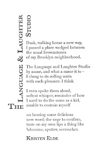
Title & Name:
 24 & 18pt Baskerville semibold small caps
Body: 13pt Didot Roman & reversed Italic
Didot is a contemporary of several other neoclassical typefaces all of which evoke the age of enlightenment. What could be better for a poem about the discovery of language? The reverse italic is an effect only possible with digitally generated type - it calls attention to those three words, emphasized like a traditional italic, but slightly odd because they are unfamiliar in the speaker’s mouth.
The title of a poem is (among other things) its advertisement, it’s invitation to enter, similar to the sign on the storefront described in the poem. In this case, the length of the title provided an opportunity to shape it into a kind of marquee. Baskerville is a cousin of Didot, a fellow book typeface. Small caps helped fill out the mass of the “sign” arrangement.
Editorial & Design by Architrave Press, St. Louis 
Letterpress printed on the Heidelberg at All Along Press, St. Louis

6.07.2012

Rising Action by Ray Holmes


Click the image to read the full text of the poem, or purchase it here.
The Poet:
Ray Holmes is a graduate of the MFA program at the University of Missouri—St. Louis. His poems have appeared in Fjords, Chariton Review, and Iron Horse. 
The Poem:
This poem is a treasure hunt. On the first read, all that’s apparent is disquiet. Something happened that summer, something important, but what? An initial survey of the territory reveals the outline of a regular summer full of girls, his father, chores, but after that, the reader must retrace their steps. It’s only on subsequent reads that the patterns begin to emerge, patterns of noise and silence, of nighttime darkness brought into the day by the eagles’ “noise and eerie bursts of shadow.” It gives an ominous cast to how the speaker is “growing” and “had more hunger.” But because this is a poem and not a story, there is no obligation for the poet to resolve anything. It is enough to make suggestions, to awaken memories of similar summers, when we knew the world had changed but we couldn’t immediately tell how. It is the essence of adolescence.
The Design: 
Title & Name:
 30 & 20pt Optima Roman
Body: 12pt Baskerville
This poem borders on story and a classic book typeface like Baskerville serves to reinforce that association. The title is a direct reference to story structure and therefore needed a typeface that feels sturdy, something capable of supporting the weight of everything that follows. Optima has the necessary solid verticals but also wide open bowls that leave plenty of room for the imagination.
Editorial & Design by Architrave Press, St. Louis 
Letterpress printed on the Heidelberg at All Along Press, St. Louis

6.04.2012

Anthology by Shane Seely


Click the image to read the full text of the poem, or purchase it here.

The Poet:
Shane Seely’s first book of poems, The Snowbound House, won the 2008 Philip Levine Prize for Poetry and was published by Anhinga Press in 2009. His work has recently appeared or is forthcoming in The Southern Review, The Florida Review, Cave Wall, and elsewhere. He lives and writes in St. Louis. 
The Poem:
This poem’s simplicity is deceptive. It invites multiple interpretations, but a complex discussion must begin somewhere. One starting point is with our basic desire to learn, how it propels us out into the world, to see and touch everything, the better to know. Quickly that’s followed by the desire to catalog what we find, to give it structure, and in so doing, make meaning. But then the desire to collect, to possess, rears its head. There’s a line, the poet insists, and there are consequences when you cross it. There will always be those who refuse to come quietly, to fit neatly into our structure, who “refuse/ to press the way the others/ pressed” and are diminished when we force the issue. Seely lets the Jack speak last, where its insistence on self definition will reverberate into the silence just after the poem.
The Design: 
Title & Name:
 32pt & 24pt Bodoni Roman
Body: 14pt Bodoni Roman & Italic
Giambattista Bodoni was a master typographer and printer of the 18th Century. Among the many typefaces he designed over the course of his life, this one bears his name and is the basis for an entire family of related typefaces. His Manuale tipografico compiles specimens of Roman, Greek and Cyrillic faces as well as a collection of printers’ ornaments and borders. His basic advice on typesetting still applies in the digital world. The poem’s concerns so closely parallel Bodoni’s that his typeface was the inevitable choice.
Editorial & Design by Architrave Press, St. Louis 
Letterpress printed on the Heidelberg at All Along Press, St. Louis